fredag den 13. september 2013

Studio Exercise 4

Ruy Ohtake - The architect 


The Japanese artist Tomie Ohtake traveled to Brazil in 1936, but due to World War II, she could not return. In 1951 she started painting and latter became a rewarded artist with work featured in several cities in Brazil, but mainly in the state of São Paulo. (#1)
In 1938 the son of Tomie Ohtake, Ruy Ohtake, was born in the Móoca neighborhood of São Paulo (#2). Ruy majored in Architecture at the University of São Paulo at the age of 22 (1960), where he later went on to teach as full professor. Just the year after he graduated, in 1961, Ruy started his private practice which is the origin of the works he is so famous for. 
Lets look at two statements made by Ruy Ohtake.

"Architecture cannot be understood in itself, because it is a central component in the complex social structure of a country. The level of social equity is always reflected in the architectural production. The more equitable and just the society, the more interesting its architecture.""The extreme unevenness of the Brazilian society is very unpleasant, but it cannot be forgotten, because it influences the whole architectural process." (#3)

Brazil currently has around 200 million citizens (#4), a lot of them living in the bigger cities as Rio de Janeiro and São Paulo where the population density is very high, especially in the suburbs. He mentions the unevenness and equity of a society as important factors for the architecture. Ruy Ohtake is clearly influenced by the poverty and unevenness of the Brazilian society. The question is if it good way since he says that the more equitable and just a society, the more interesting is its architecture. He is probably referring to Brazil/São Paulo as a whole because the architecture of Ruy Ohtake is definitely interesting.
Ohtake says that his main goal when contributing to Brazilian architecture has been to reflect the Brazilian culture in his architecture like the Bossanova (Brazilian music genre which among other things produced the Garota de Ipanema - The girl from Ipanema)  once did. The element of the liveliness of the Brazilian people is clearly integrated in the buildings of Ruy Ohtake. An example of this is seen in the Brazilian Embassy in Tokyo, which Ruy has designed.

#1 - Exterior of the Brazilian Embassy in Tokyo
#2 - Interior of the Brazilian Embassy in Tokyo

As seen on the above images of the embassy, Ruy Ohtake uses curves a lot in his architecture. Ruy Othake says the following about curves (#3):
"I like curves, all types of curves. I have been using them since my earliest projects. But the one I am constantly searching is that of surprise, of the unexpected.The unexpected curve is the one that makes us follow it with our eyes through all its extension, because we know it can change at any moment"
We clearly see this in all of Ruy's architecture, and it is actually quite common in Brazilian architecture to move away from the frames of regular geometry.
#3 - Examples of the usage of curves

Ruy Ohtake makes some very interesting external facades, but his interior is just as interesting. Here are some examples from the resident of his mother, Tomie Ohtake, which he has designed.


#4,5,6 - Interior design of Residensia de Tomie Ohtake
The request
My wish for a house will be a student housing for around 20 students living together. The bedrooms must be private and good sound insulated, with bathroom and wardrobe attached. The kitchen will be the primary assembly point of the house and must be easily access-able from all of the bedrooms. The kitchen must be an open space room so it allows for multiple different usages of the room. There must be a big dinner table, big enough for all the habitats to dine there at the same time, directly connected to the cooking area to demand social interacting when making dinner/breakfast or whatever. 


#7,8 Danish student housing as inspiration

There must be an activity room with games and competitive elements for the students to use. This must be connected with a room for physical exercise to keep the habitats in shape.There must be a craft shop  a cinema and a music room - or the opportunity to create such in a multiple purpose room.
The furniture must be able to move around to suit different occasions.

It must be possible to enter your bedroom without having to go through all of this shared space so the students can enter their room quietly if needed. 

The architectural style must contain lively curves to reflect the life of a student - just like Ruy Ohtake is so famous for. Colorful artistic drawings and unique interior decorations will decorate the walls where it is suitable. The materials can be very raw and simple as the interior in the residence of Tomie Ohtake. 

Sources:

Image sources:

søndag den 8. september 2013

Assignment 1 - Primitive forms

Assignment 1 - Primitive forms

LINK TO PDF: 
https://www.dropbox.com/s/pvhu5nk66sln0lr/Assignment%20%201%20-%20z3476855.pdf
LINK TO SKETCHUP MODEL: 
https://www.dropbox.com/s/p0tymqtz1s1rc59/SketchUp%20model%20-%20Assignment%201%20-%20z3476855.skp


Description of project:

My design consists of a box, a wedge and a pyramid (#1). The box has been tilted about both horizontal axis and lowered 1.2 meters down into the ground. The wedge and pyramid is put together to form which forms a kind of solid star. SketchUp has been used for volume calculations – the box is 230 m3 and the combination of the wedge and pyramid, with the box subtracted, is 640 m3 (#2). I used box representations of the room volumes to fit the rooms. The box is used for living room and a guest bed- and bathroom underneath (red boxes). The intermediate space of the building is used for public functions (green boxes) and the far end is used for public space (blue boxes) (#3). The master bedroom and the en suite are hidden away in the far top with a staircase leading down to the study. The pointy ends of the pyramids produce some interesting external shapes for windows, which are really seen in the study. The box is used for living room with guest bath- and bedroom beneath. In the core of the building are the kitchen, dining room and entry. The house has two external doors, one leading to the guest area and one leading to the entry. From these two entry points it is possible to move everywhere in the house (#4/#5). 

Initial modelling:


Circulation diagrams:


Plan drawings:


Elevations - Images are all in PNG format so they should be viewed in the PDF for a white background color!:


 Isometric views:


Rendering:


fredag den 30. august 2013

Studio Exercise 3 - Posterboards

For this weeks exercise we were to use our abstracted form created during the paper folding exercise. In addition to this 2 of our analysis views from the last week studio - I chose a section showing public/semi-private and private and a plan showing movements. Along with this I used several pictures of the Hotel Unique to give an impression of the building. I find the building itself kinda something you could see in a very dream with its truly unique half moon shape. I kinda chose this as a theme for the poster. I tried not to be too clear of how the building actually looked. I used the abstract form as a kind of canvases for the images.
I used A3 size for the poster.


I used a space background to support the moon shape of the building.

torsdag den 29. august 2013

Research Exercise 2

For this exercise we were to find 3 examples of graphic representation boards that somehow awoke our interest.


I like some of the concepts of this graphic representation board regarding a battery park. What I really find attractive is the spatial relationship between the rendering and the bird-view perspective of the park. The two different kind of graphic representations share the same horizon line which gives a very fluent transition. Transitions are often, for me, one of the hardest things to do properly when creating a board. I like the color manipulation of the tree – from the lively green fitting the rendering to the more serious grey suiting the project summary on the right side. I think the small diagrams in the downward left corner could have been done in a much more elegant way.


 I like the connection between the iconic pictures and the plan view of the project. The black background colors gives a sharp contrast between the light colored pictures and make them “jump” out of the page. The amount of text is quite large but is smoothly fitted on the poster in their natural places next to the bobble shaped images, which make the user wants to view and read afterwards.


This poster has a very nice color scheme. Transition between the big plan view and the block of text is a simple, but effectfull, fading effect. The poster looks very calm and invites the viewer to study it closer. The colors of the plan drawing is melting in to the background leaving mainly the contours of the site visible. This brings out the interesting information of the Brisbane Transportation Centre in a very clear way.

Sources:

#1: http://parametrication.files.wordpress.com/2010/07/board-01.jpg
#2: http://www.archdaily.com/188122/the-mobius-portal-to-the-point-weissmanfredi/portal-point_boards_page_3/

#3: HOK San Francisco: http://www.hoklife.com/tag/san-francisco/

fredag den 23. august 2013

Studio Exercise 3 - Technical drawings of chosen building

Stage 1 - Gathering material


I work with Hotel Unique designed by Ruy Othake. I were not able to find any floor plans but luckily I found a simple model at Google Sketchup 3dWarehouse from which I could work off. The models name was Hotel Unique by Eric Mancinelli. I estimated concrete slabs of depth 200 mm as decks. I drew these between the windows which created the six stories I read the hotel have.

To make the floor plan was more difficult because the room varies in size, some more luxurious than others. Lets have a look at the facade:


#2 Facade in daylight
We see here a total of 37x2 = 74 windows on each side (symmetric). I was able to read that there is a total of 95 guestrooms available at Hotel Unique, which means that for the rooms to have at least one windows there will have to be rooms at each of the two external facades. This is why I chose to put the hallway in the middle. The part of the external wall without windows I estimate to be the space used for circulation. Probably a staircase in one side, and a elevator in the other. The rest of the space I imagine is used for dwellings. 

Here is an example of the interior:

#1 Interior


I estimate that the rooms have two windows, where this probably varies a lot in the real building.

I watched some videos of the building to get a better impression of it:
http://www.youtube.com/watch?v=oRL0WLPB37E
http://www.youtube.com/watch?v=A4J6hMkE-n4

Though their main focus was just pointing out that the hotel is very unique.


Stage 2 - Section and floor plans

First part was to create a plan and section of the private, semi-private and public areas of the building.


Next step was to describe the circulation in the buildings in a section and plan drawing.


Final step was to extract the simple shapes represented in the building which in my case is very clear.


Regarding the structures it seems like a catenary arch, which is very ideal for absorbing moments because its shaped as an arch - moment curve as result of uniformly distributed load. This is not totally true because the original building is also supported by a steel structure at the bottom of the arch. If it were not supported here the concrete slabs in each side would probably have to be a lot larger and would definitely change the expression of the building. By making the bottom support transparent I think that the building has structurally created a good illusion of being carried by the 300 mm concrete slabs at each side.

Image sources:
#1: https://www.google.com.au/search?q=hotel+unique+sao+paulo&rlz=1C1ASUT_enDK485DK485&um=1&ie=UTF-8&hl=da&tbm=isch&source=og&sa=N&tab=wi&ei=ksgWUs-fI835lAWHx4DYDg&biw=1745&bih=860&sei=lMgWUqWGEMb5kAXtmIBg#facrc=_&imgdii=esiCEZ4Q2om9QM%3A%3BCJqmj746erRrmM%3BesiCEZ4Q2om9QM%3A&imgrc=esiCEZ4Q2om9QM%3A%3BmHnraLqP-dIxTM%3Bhttp%253A%252F%252Fwww.trainperformance.com%252Fwp-content%252Fuploads%252F2010%252F08%252Fsao-paulo.jpg%3Bhttp%253A%252F%252Fwww.trainperformance.com%252Fthe-fitness-bug%252F8-of-the-worlds-best-hotels-for-post-workout-relaxtion%252F%3B337%3B450


fredag den 16. august 2013

Post 2 – Weekly progress

I started off making a table in Excel containing all the rooms supposed to be in the house. I assumed rough dimensions for the rooms, but since they are just to be made as boxes at this step, the dimensions will probably change a lot along the way. I split the rooms into three different categories private, semi-private and public. I’ll try to keep boxes in the same category together, and perhaps have public in one end of the house, and private in the other.

#
Room
Width [m]
Length [m]
Area [m2]
Category
Color
1
Master bedroom
5
4
20
Private

2
Ensuite bathroom
4
4
16
Private

3
Childrens bedroom
4
4
16
Private

4
Childrens bathroom
3
3
9
Private

5
Study
3
3
9
Private

6
Guest bedroom
3
4
12
Semi-Private

7
Guest toilet
3
4
12
Semi-Private

8
Kitchen
6
4
24
Public

9
Living room
8
6
48
Public

10
Separate dining room
5
5
25
Public

11
Laundry
4
4
16
Public

12
Parking for 2 cars
5
5
25
Public

Total Area


232

I left some area for circulation but I’ll probably need more than the 18 m2 I have at the moment, but they can be taken from the rooms. Also note that with a standard room height of 3 meters, it will not be anywhere near the 900 m3 suggested in the project description. This way the master bedroom or the living room could be made really nice with high ceilings. With this is a starting point I modeled the rooms as boxes in SketchUp. I labeled the room as the numbers in the table, grouped everything and started doing some compositions.  Here are some step by step photos of the room composition.


Here are some snapshots of playing with the 3 primitives shapes.


As seen in the table the light blue ones are the public areas, the dark blues are the private areas and the blue in between are the semi-private areas. I’ve tried combining these areas in different ways. But mainly I imagine the public space to be the connecting joint between these two types of areas. I like the proposal with the flipped pyramid the best, so I think I’ll proceed with that. 


fredag den 9. august 2013

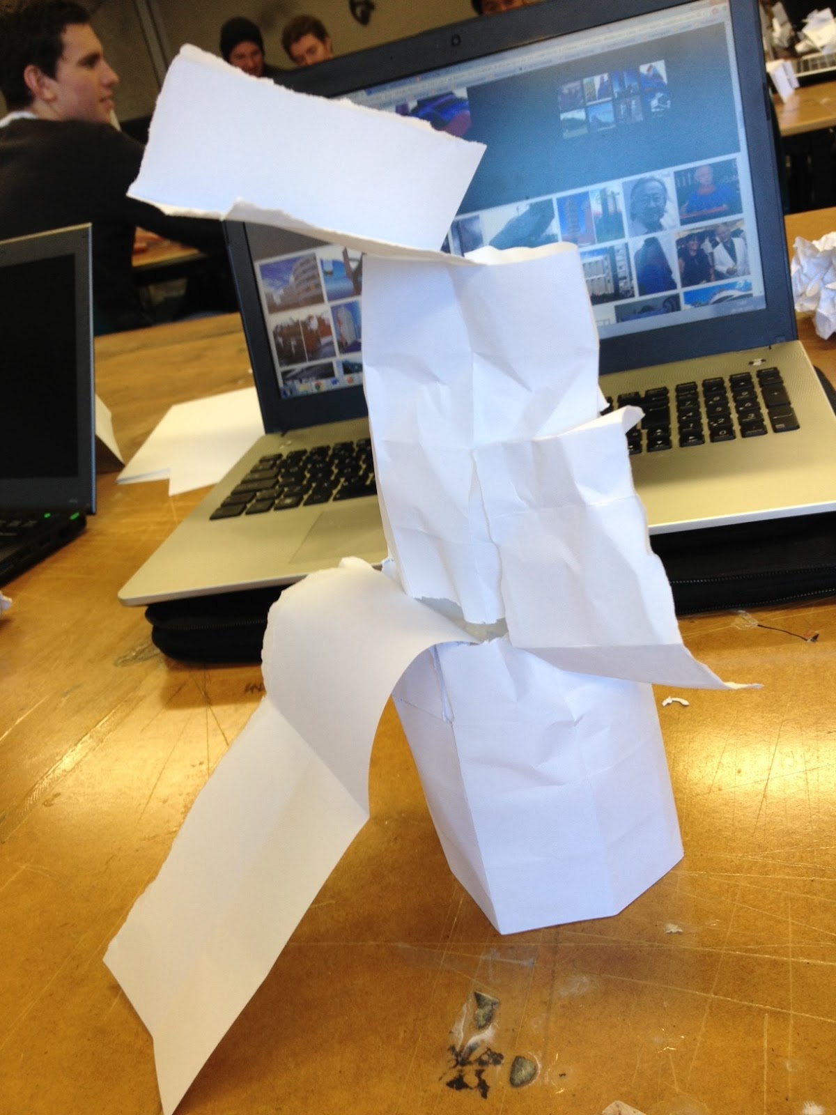
Studio Exercise 2 - Paper folding

This exercise was about folding single sheets of paper to shapes inspired by the chosen architect. I have chosen to work with Ruy Othake and his design Hotel Unique in Sao Paulo. I chose to view the hotel from a spatial point of view. The hotel, seen in the picture below, with its moon shape has some clear curving shapes. I chose to try and interpret those shapes by folding the paper as to form an overall curving shape, with some "holes" to resemble windows. Ideally those would have been round but that was quite hard to do. Insted I made them squared but twisted 90 degrees.

Model #1 - Abstract intepretation


Model #2 - Inspired by patterns
Second model was inspired by Ruy Othakes use of wave-like shapes e.g. as used in the Villa Residencia, seen on the picture below.


Model #3 - Free model

I did not have any scissor or tape so it did not really make a difference for me - except I was now able to use more sheets of paper. I wanted to make something that resembled Ruy Othakes high-rise buildings but it was to make the paper stick together. The idea was to place some curved shapes along the facade of the tower.


In conclusion, I actually found it better to work just one single sheet of paper to, as said in the tutorial, make one think closer about the production method.

Image sources